0
Skip to Content
Projects
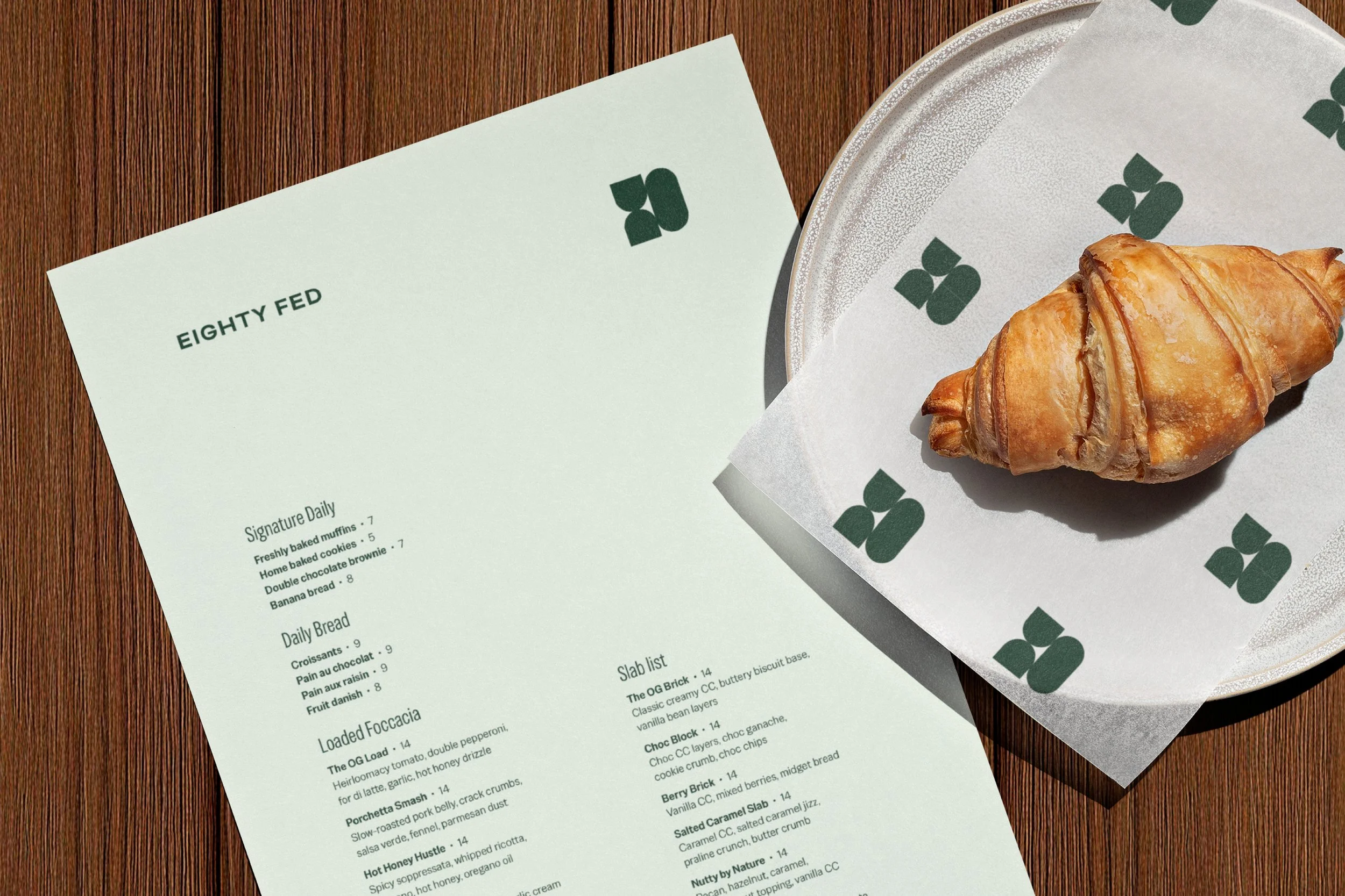
+ Eighty Fed
+ Chorus
+ 2degrees
+ The Grill
+ Deloitte North
+ Ipsos
+ Weave
+ Inside Dairy
+ University of Auckland
+ realestate.co.nz
+ The Grand Hotel
+ Treehouse Kids
+ Pretty Urban
About
CONTACT
Open Menu
Close Menu
Open Menu
Close Menu
Projects
+ Eighty Fed
+ Chorus
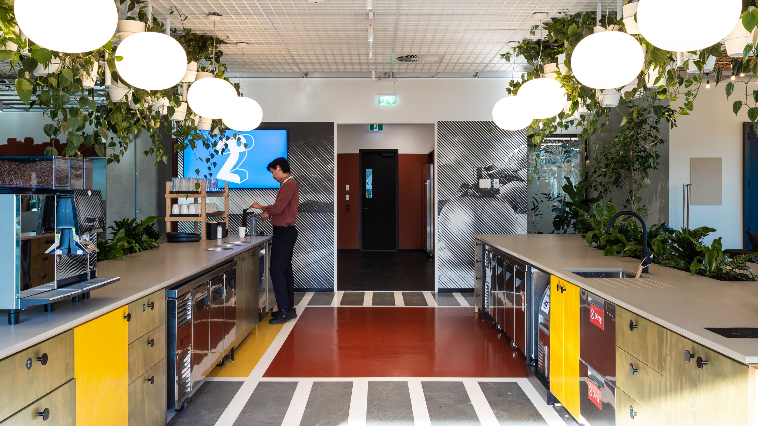
+ 2degrees
+ The Grill
+ Deloitte North
+ Ipsos
+ Weave
+ Inside Dairy
+ University of Auckland
+ realestate.co.nz
+ The Grand Hotel
+ Treehouse Kids
+ Pretty Urban
About
CONTACT
Folder:
Projects
Back
+ Eighty Fed
+ Chorus
+ 2degrees
+ The Grill
+ Deloitte North
+ Ipsos
+ Weave
+ Inside Dairy
+ University of Auckland
+ realestate.co.nz
+ The Grand Hotel
+ Treehouse Kids
+ Pretty Urban
About
CONTACT
Graphic Design • Branding • Creative Spaces • Illustration